Lightspark: Built for the Next Century of Money
Three years ago, we started Lightspark with a simple conviction: The way money moves should match the speed, openness, and intelligence of the Internet itself. Since then, the world has responded to a new kind of value — digital, borderless, and instant. But the infrastructure to move that value remains outdated, closed, cumbersome, and expensive.
Everything we do at Lightspark aims to change that.
Today, we’re unveiling a bold new identity that reflects who we are and where we’re going. It’s a system designed for developers ready to move beyond the constraints of legacy infrastructure and toward a faster, more innovative, and more open payments.
A Brand Built for the Network We’re Building
Our new identity reflects how money is evolving. Not just a new logo or color palette - it’s a design system built to move as dynamically as the network behind it. We’ve rethought everything — from typography to motion — to echo the principles that drive us: open access, instant settlement, global reach. This is the new face of a faster financial future. Powered by Bitcoin and built on the Money Grid.
Our technology is already powering some of the most important financial experiences in the world:
- Instant Bitcoin payments on Coinbase
- Seamless payouts via UMA between the US, Mexico, Latin America, Asia and Europe
- Real-time settlement for exchanges, wallets, and digital banks
- Stablecoin issuance on Bitcoin via Spark
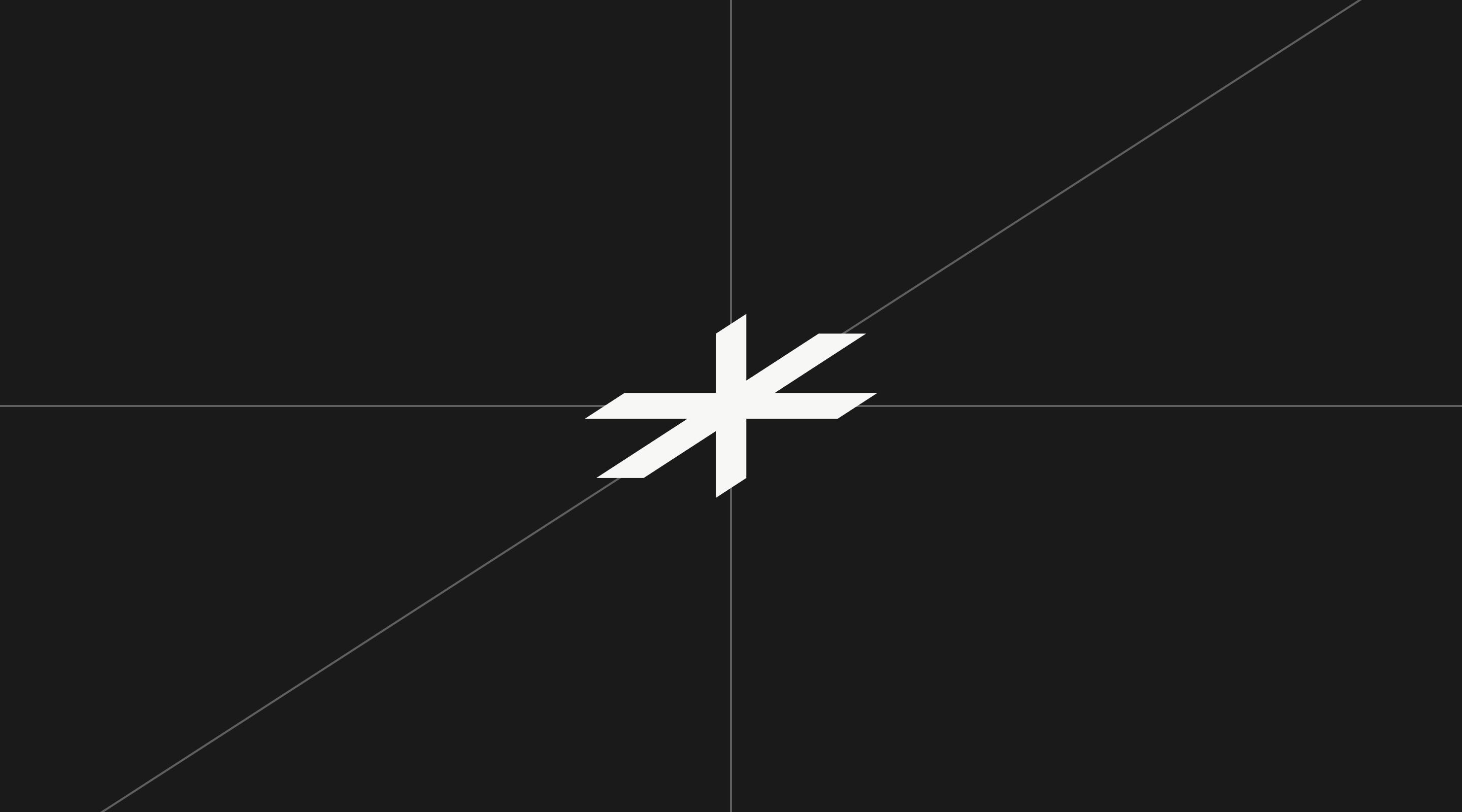
The New Mark: Beyond the Bolt
We’re moving beyond the lightning bolt. Our new mark signals the origin point of the Money Grid — inspired by the Cartesian co-ordinate system’s X, Y, and Z axes and the Right-Hand Rule from physics, a principle used in electromagnetism that connects to light waves—a nod to Lightspark’s name and mission. The design symbolizes precision, direction, and interconnected movement, reinforcing our role in powering a more efficient and intelligent global financial network. More than a symbol. It’s a navigation point for the Money Grid.
Typography: Precision, Clarity, and Scale
At the foundation of our new identity is Suisse Int’l—a modern interpretation of the classic Swiss Grotesk. Chosen for its clean geometry, timeless clarity, and international versatility, it reflects the qualities we value in the infrastructure we build: strength, reliability, and precision.
Suisse Int’l brings a functional elegance that allows information, not decoration, to lead. Its wide range of weights, global character support, and structural harmony make it ideal for scaling across surfaces, from product UIs to international campaigns. It’s a typographic system built for clear communication at scale, designed to move as fluidly as the Money Grid we’re powering.
A Palette Built to Move
Money doesn’t stop at borders — and neither does our color system. Designed to be bold, expressive, and highly functional, our palette reflects the extensible nature of the Money Grid itself. This is a working color system from high-visibility colors used in interfaces and signals, like Spark, Universal Money Address, and Connect, to a range of neutral tones for structure and contrast. One that scales across products, touchpoints, and cultures. The palette is clean where it needs to be, and loud when necessary. It’s built for scale and flexible enough to adapt to how color is seen, felt, and used across cultures.
Bringing it all Together
The future doesn’t need to be imagined; it’s here. With our partners – digital banks, crypto exchanges, non-custodial wallets, developers, marketplaces, and the entrepreneurs shaping the Money Grid - we’re just getting started.